Rai / Visual system promo pack
Rai tre /
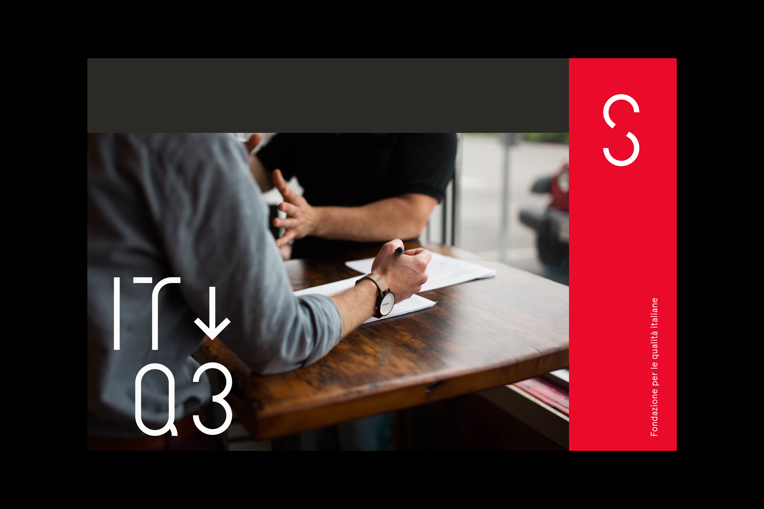
Identity Kilimangiaro
Rai / Visual system
promo pack
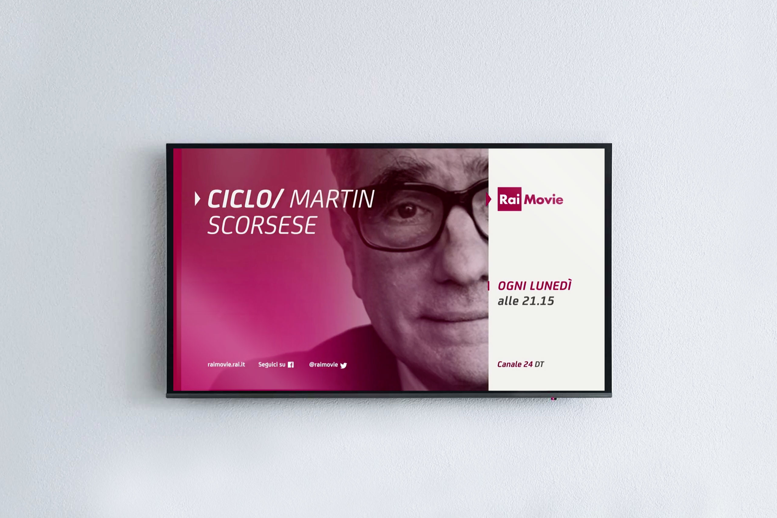
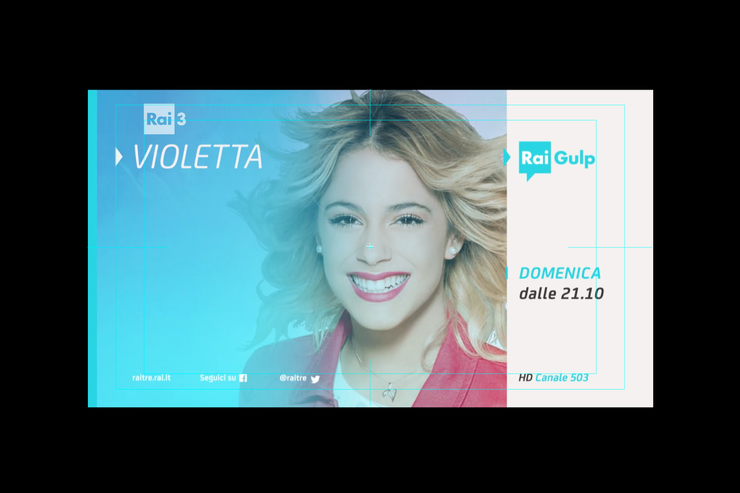
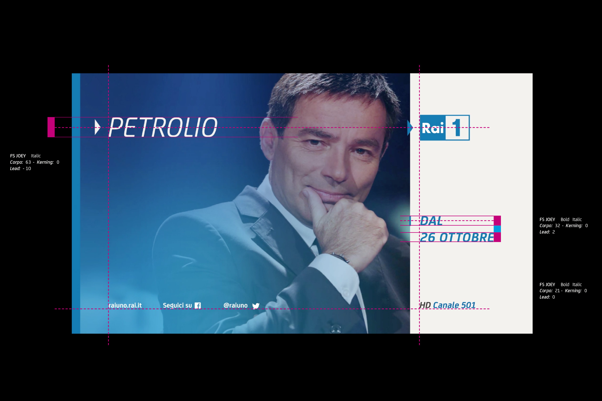
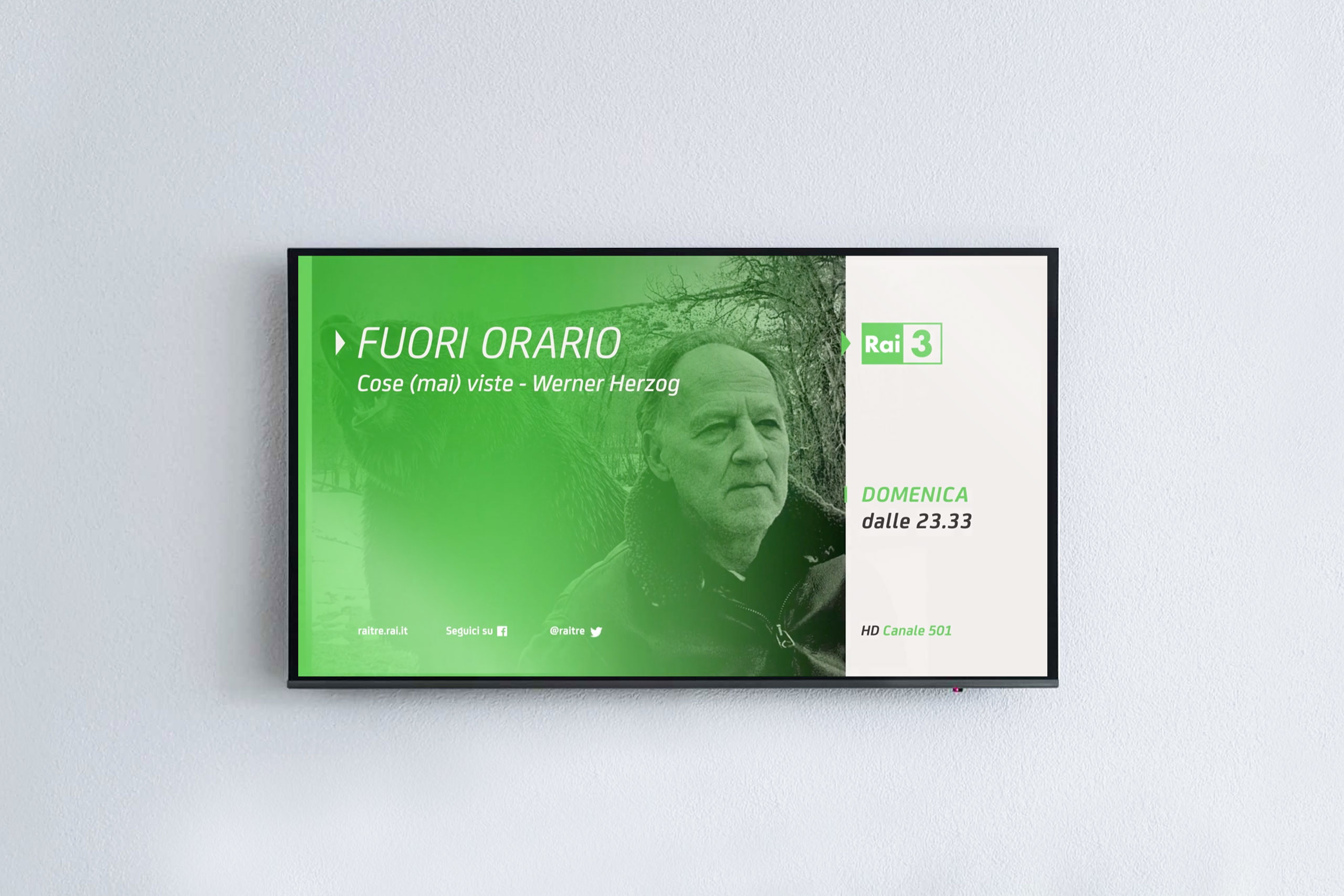
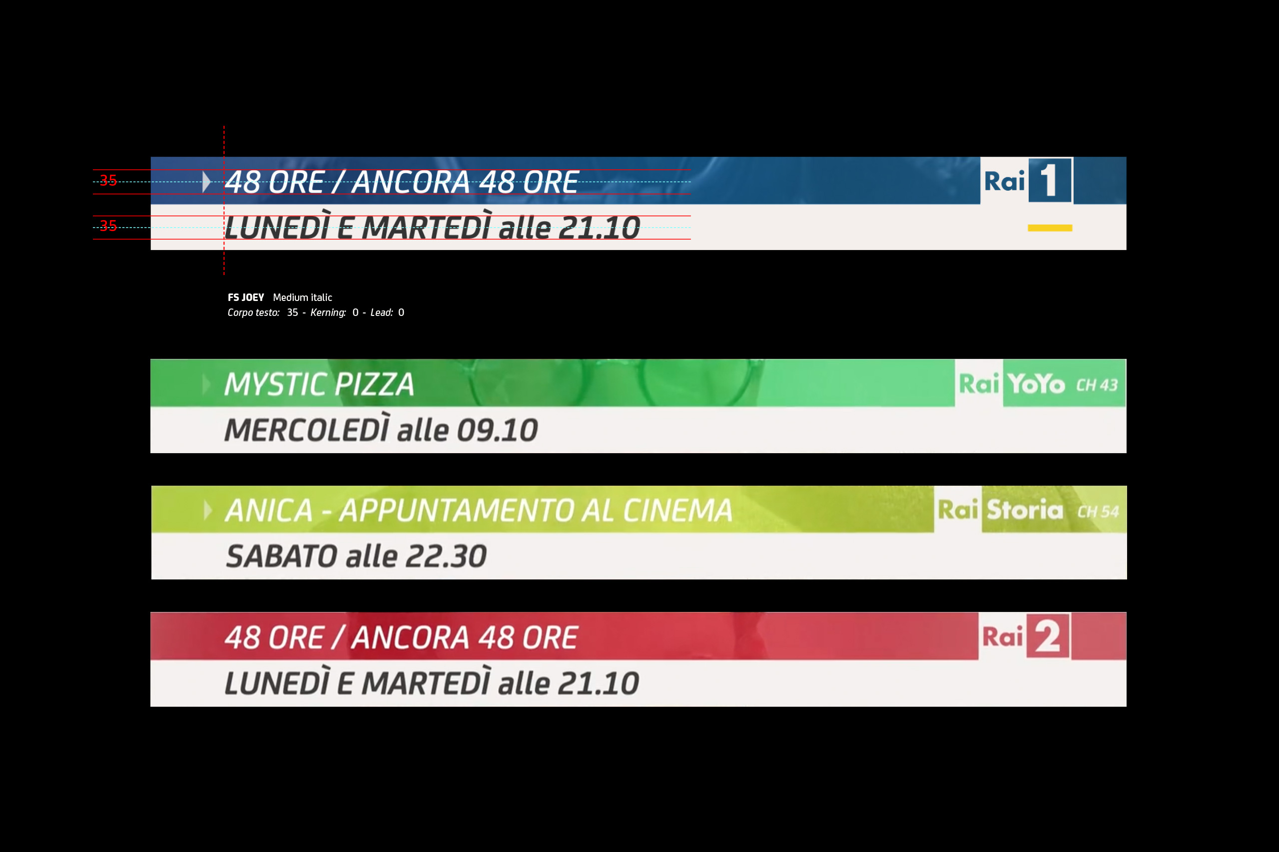
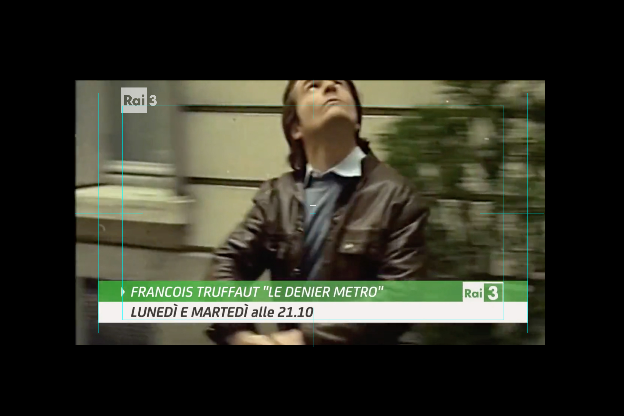
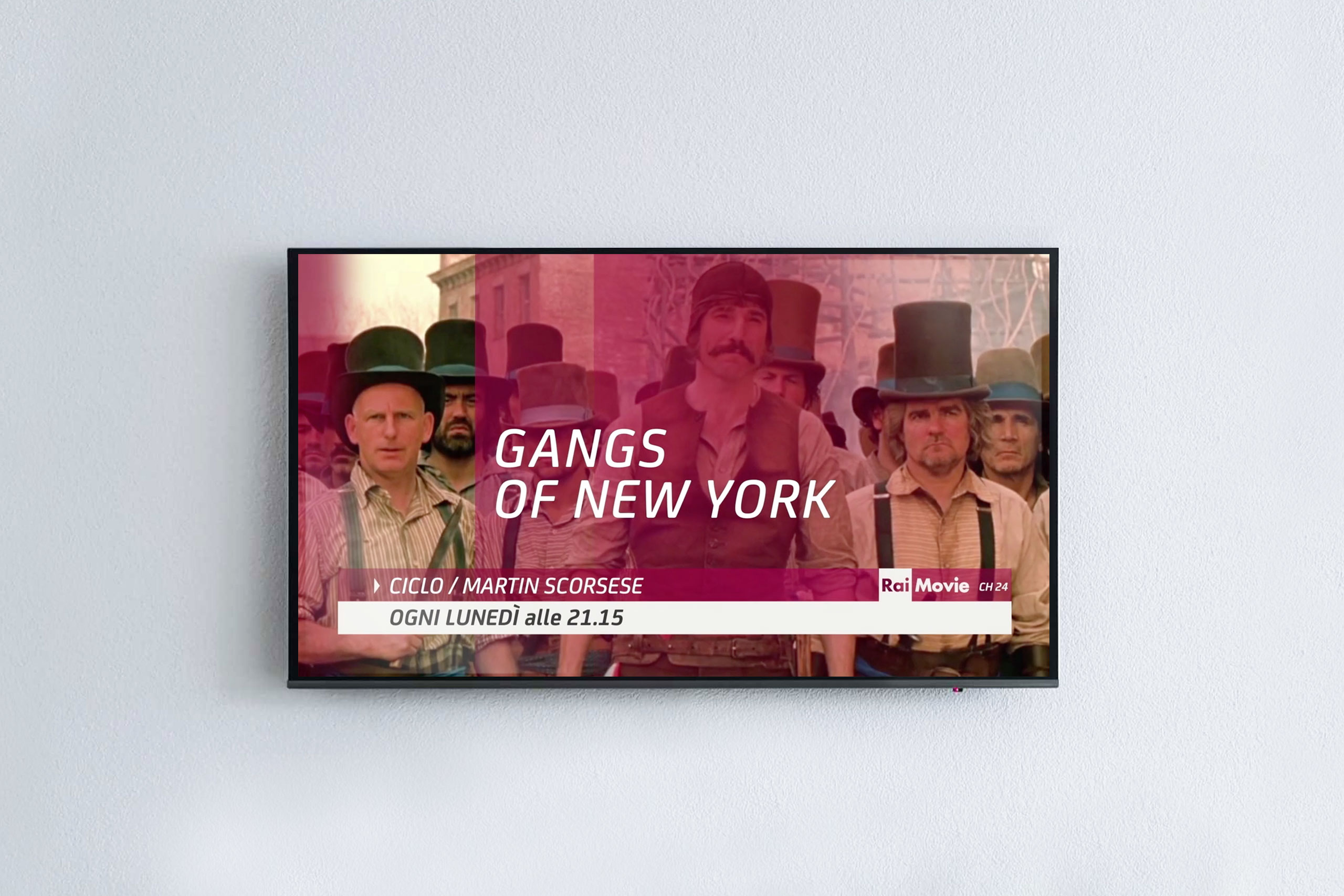
Italian state broadcaster Rai decides to redesign the visual approach of the promo pack for all its thematic and network channels.
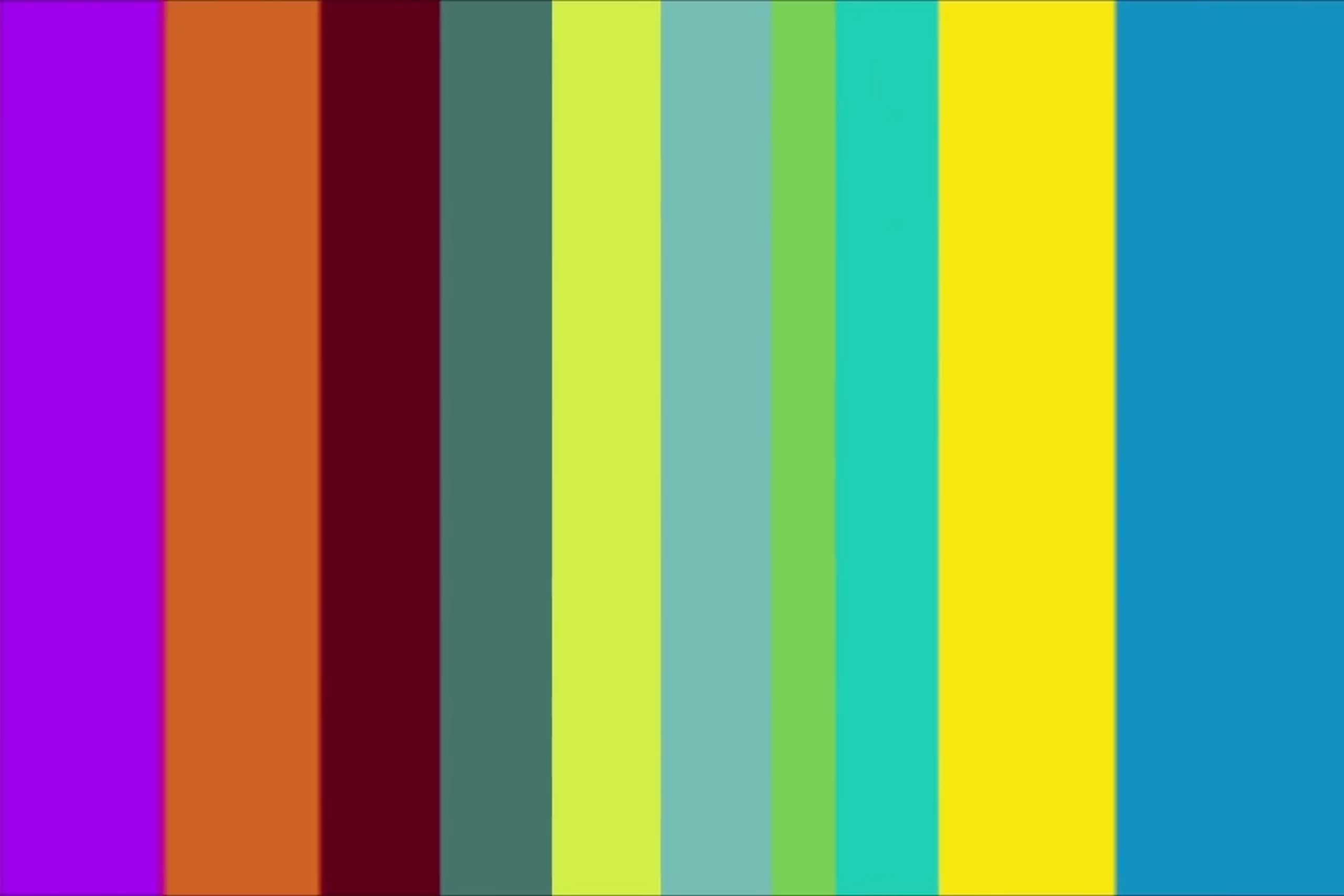
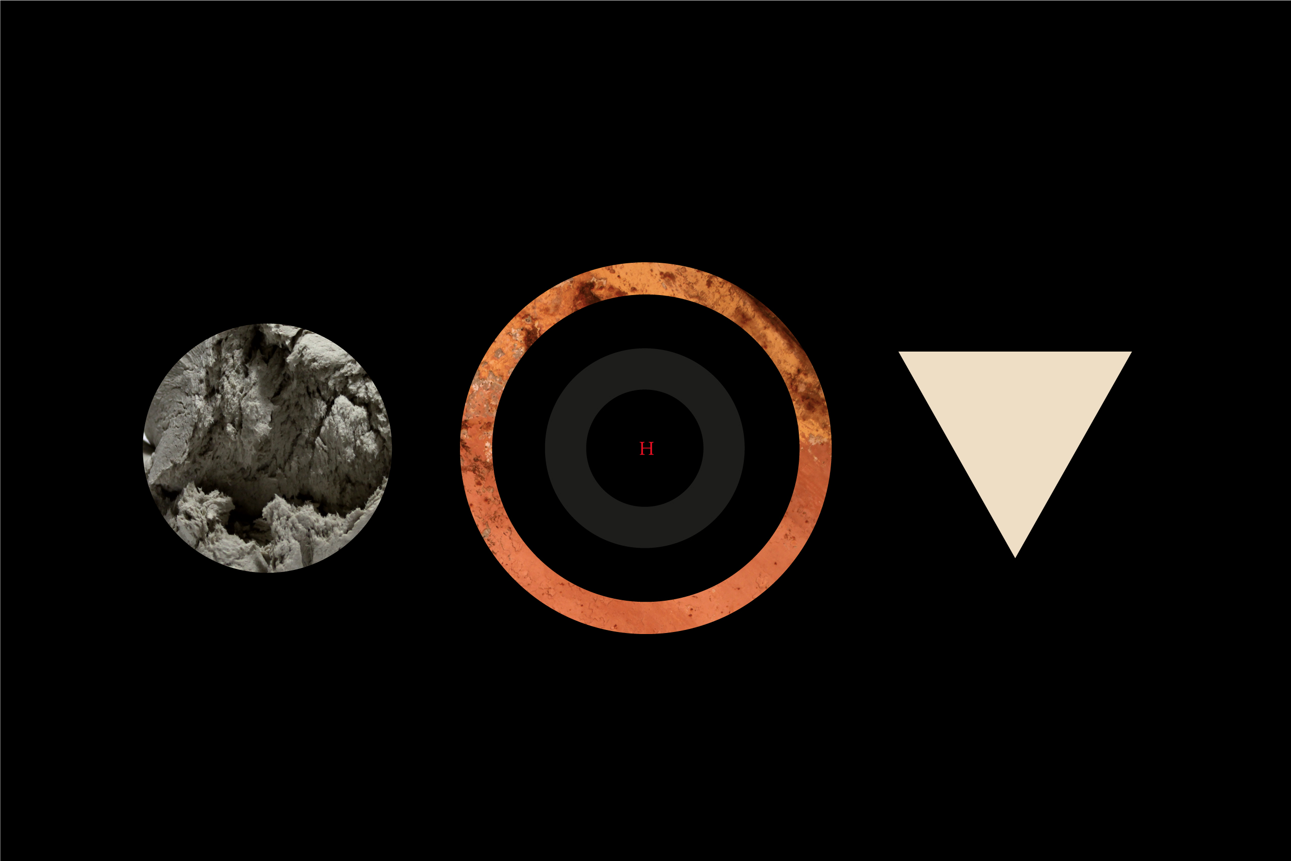
The graphic design uses a single typeface, in various different weights, to unify the communication of all 14 channels.
The institutional colours become a fundamental element of the communication, characterizing each channel and producing
a coordinated, organic visual system.
Italian state broadcaster Rai decides to redesign the visual approach of the promo pack for all its thematic
and network channels. The graphic design uses a single typeface, in various different weights, to unify
the communication of all 14 channels. The institutional colours become a fundamental element
of the communication, characterizing each channel
and producing a coordinated, organic visual system.
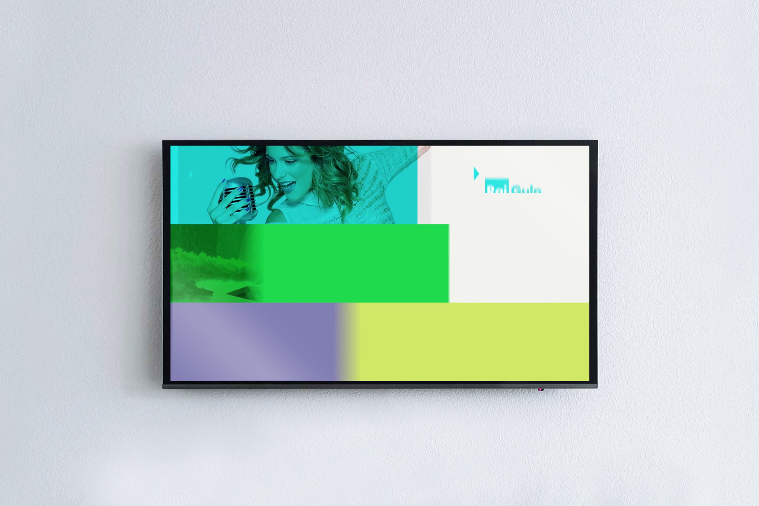
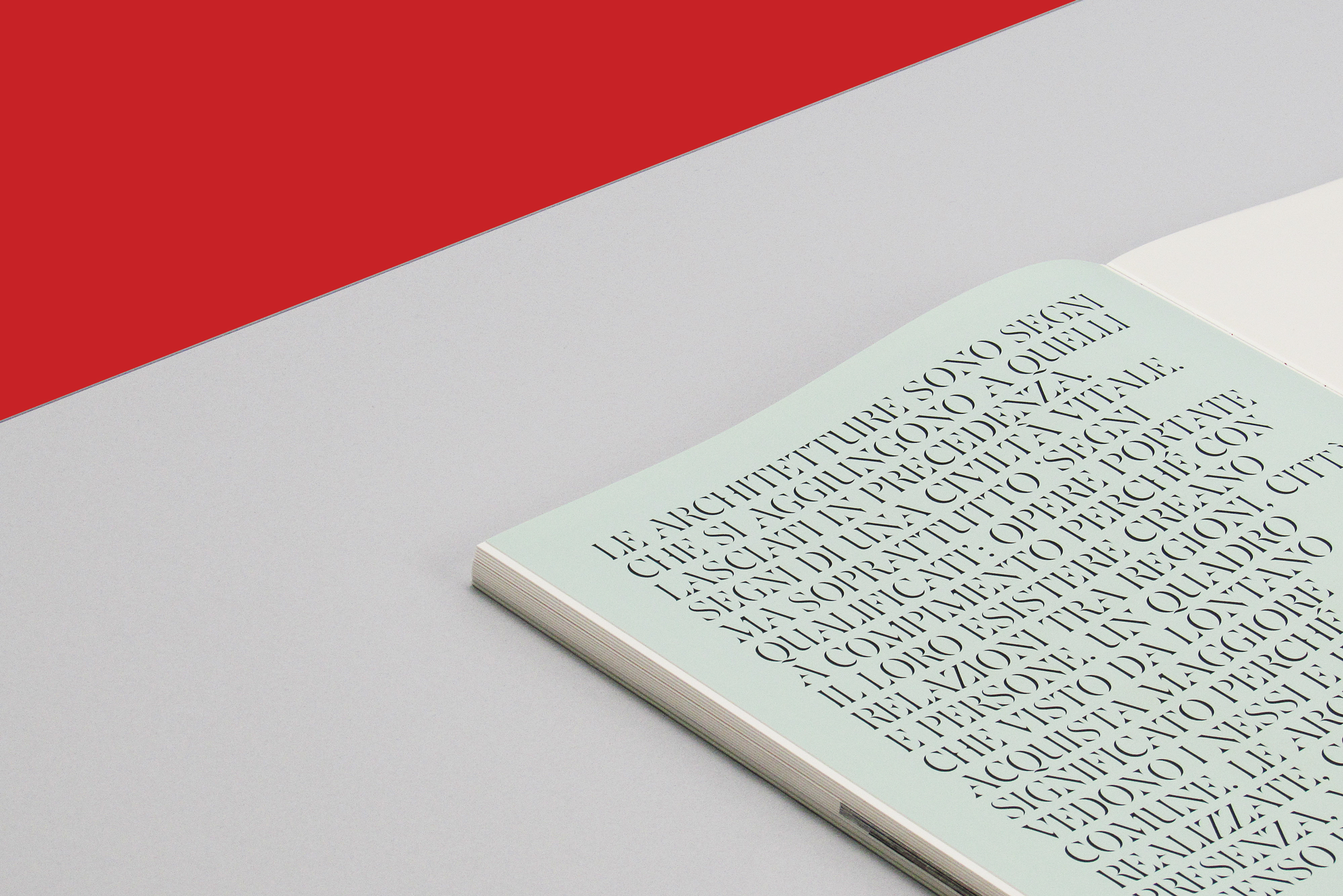
A new graphic layout for one of the Rai 3 channel's longest-running and best-loved programmes. The project sees the restyling
of the brand and the redesign of the programme's entire communication system. Coherent,
clear visual and contemporary narration which
is adopted over all contents: from features
to travel documentaries and from studio interviews to thematic reports.
Italian state broadcaster Rai decides
to redesign the visual approach
of the promo pack for all its thematic and network channels.
The graphic design uses a single typeface, in various different weights,
to unify the communication
of all 14 channels.
The institutional colours become
a fundamental element of the communication, characterizing
each channel and producing
a coordinated, organic visual system.
Graphic Design & Art Direction:
Giampiero Quaini as Head of Design at Marimo
Year: 2015
Project type: Brand Identity, Visual system
Motion Graphics by: Gianluca Abbate
Relatetd Project
→ Fondazione Memmo - Notte Oscura - Conversation Piece Part VIIIExhibition identity, Print, Environmental
→ Fondazione Pastificio Cerere - Buffer ZoneExhibition identity, Print, Environmental
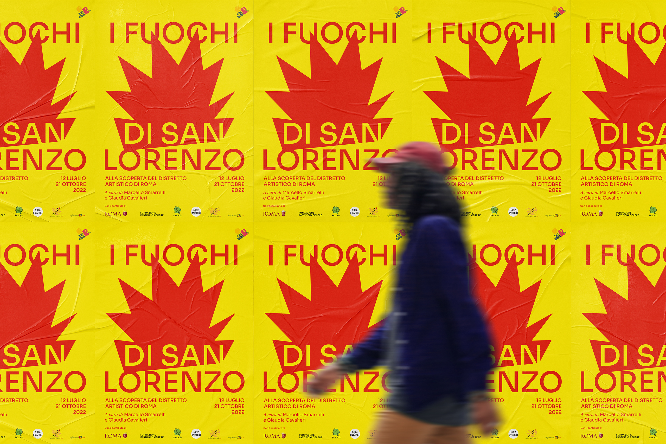
→ Fondazione Pastificio Cerere - I Fuochi di San LorenzoExhibition identity, Print, Environmental
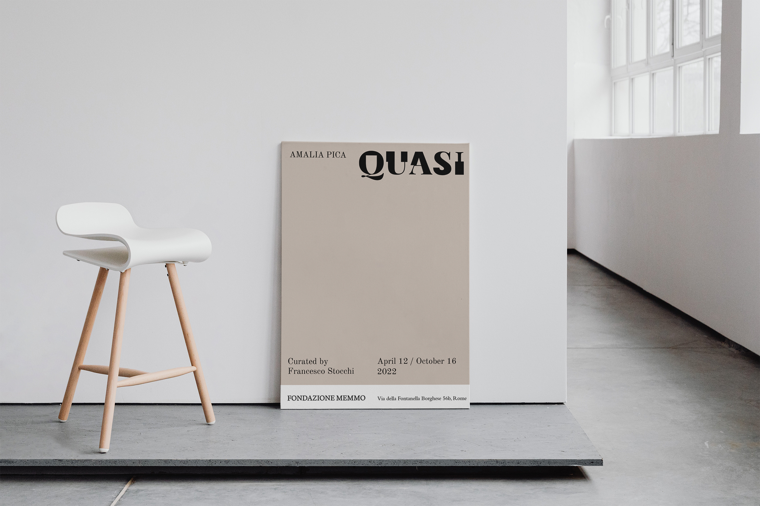
→ Fondazione Memmo - Amalia Pica - QuasiExhibition identity, Print, Environmental
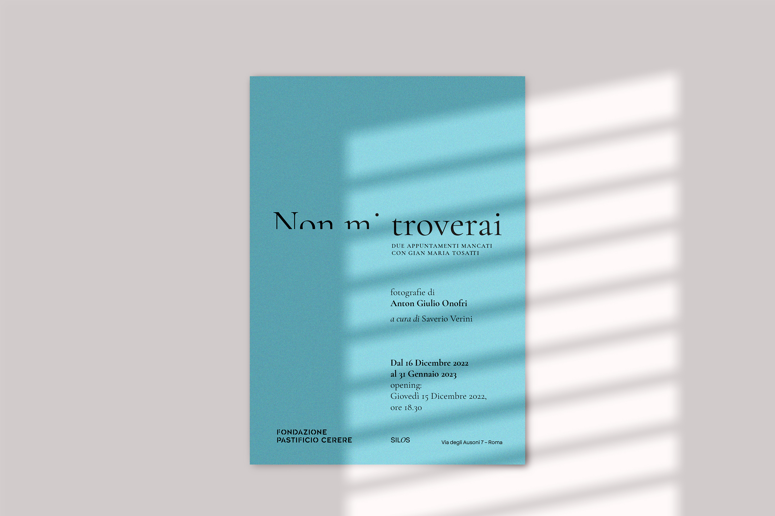
→ Fondazione Pastificio Cerere - NON MI TROVERAIExhibition identity, Print, Environmental
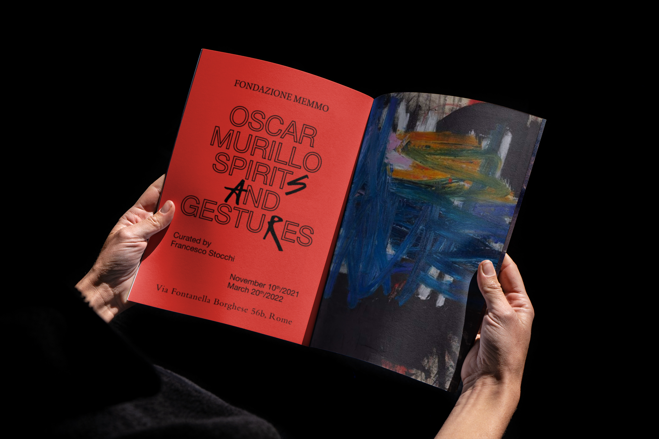
→ Fondazione Memmo - OSCAR MURILLO / SPIRITS AND GESTURESExhibition identity, Print, Environmental
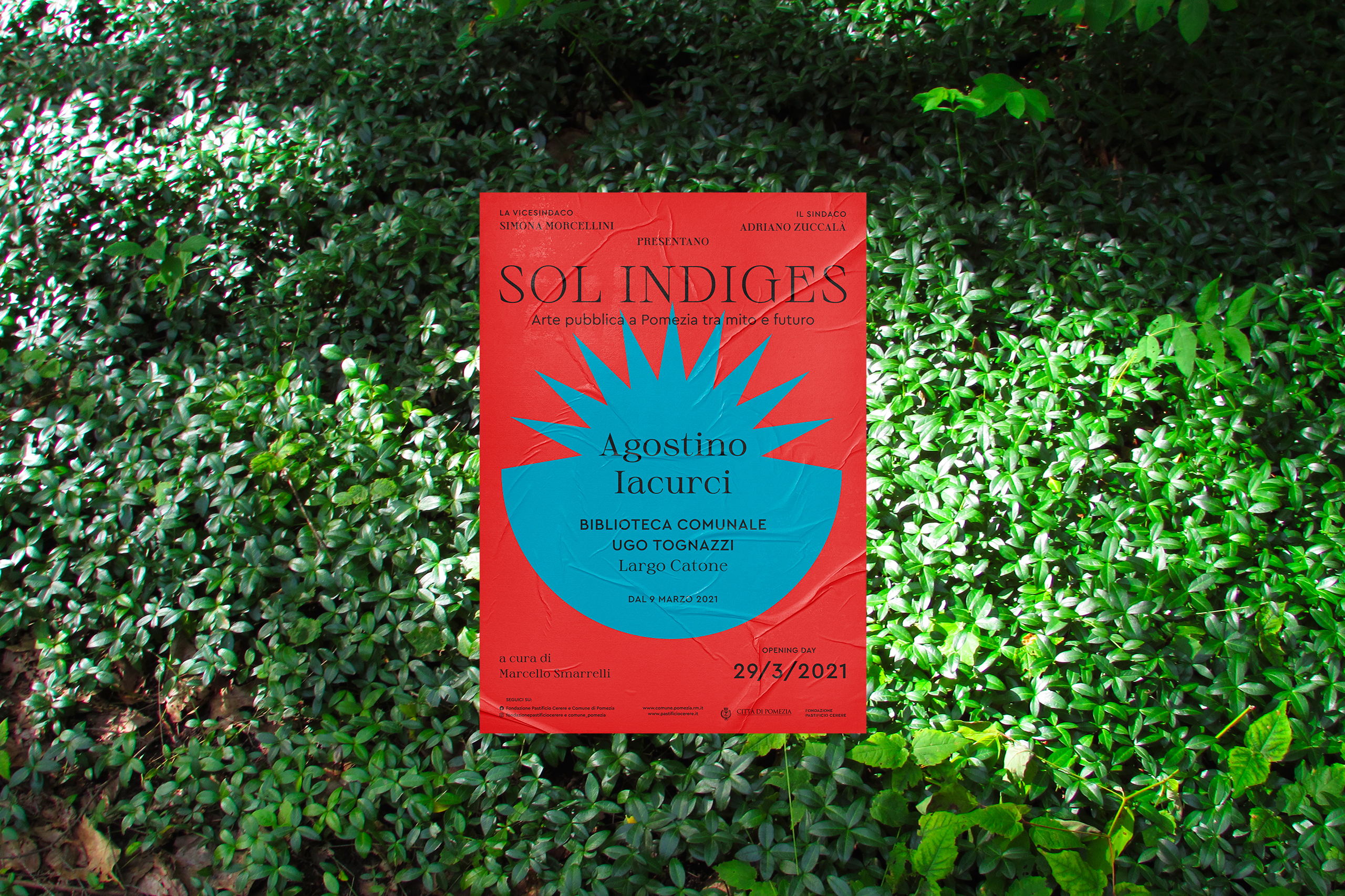
→ Fondazione Pastificio Cerere - SOL INDIGESExhibition identity, Print, Environmental
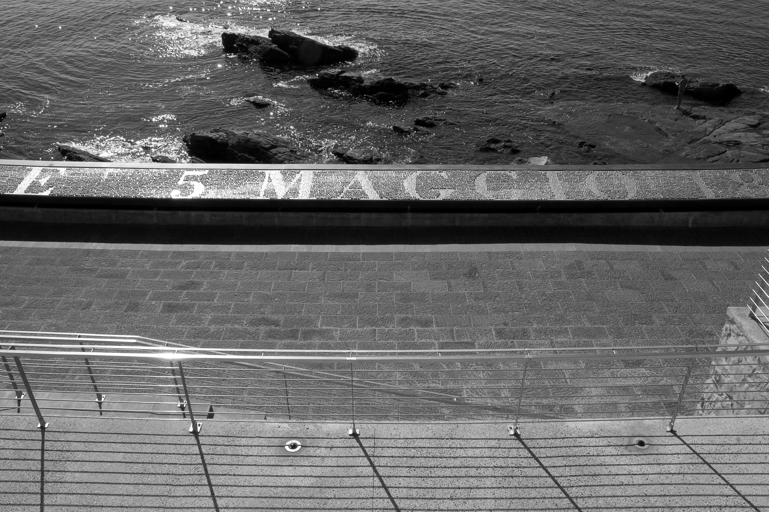
→ MAGAZZINI GENERALI OFFICESEditorial, Brand Identity
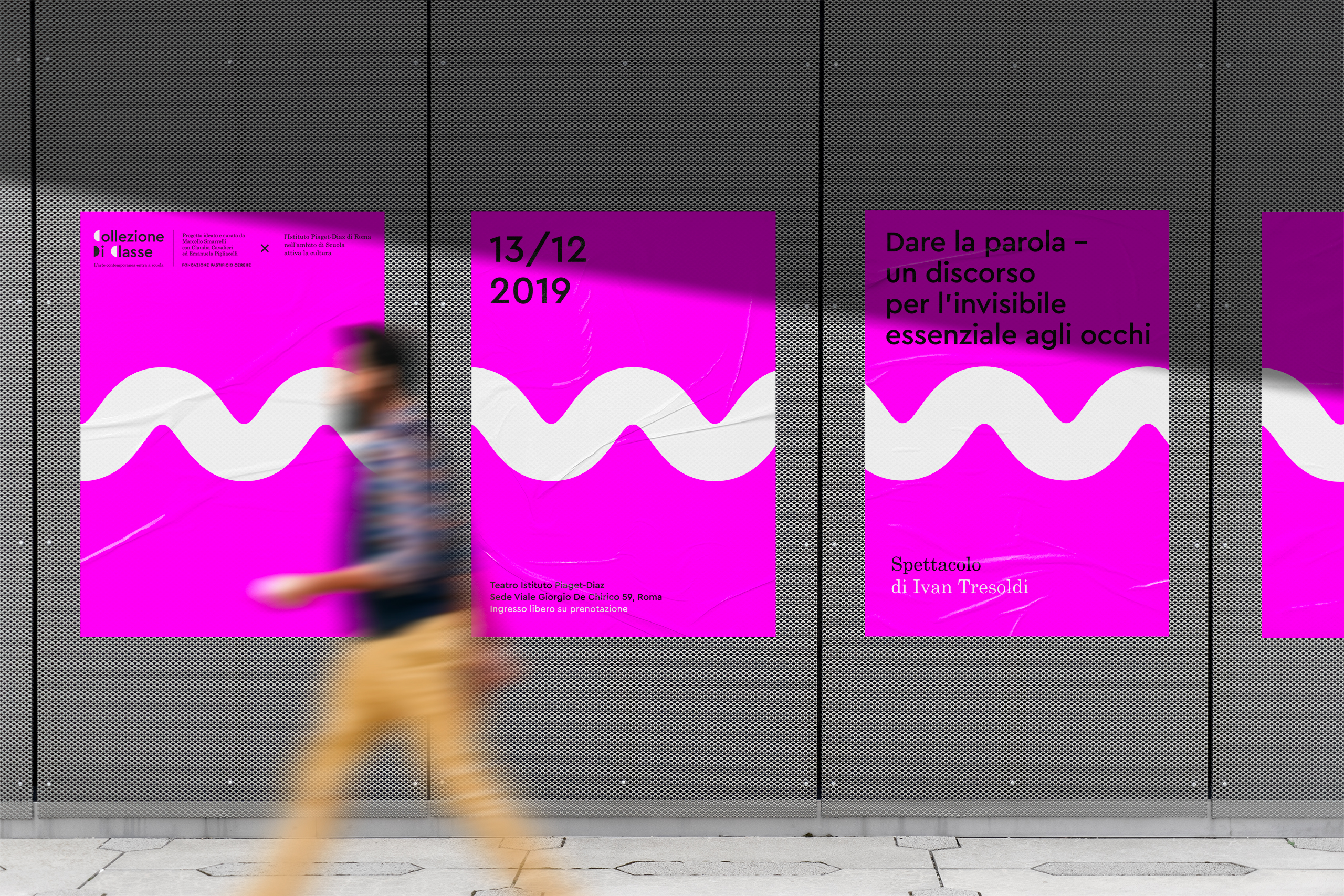
→ Fondazione Pastificio Cerere - Collezione Di ClasseExhibition, identity
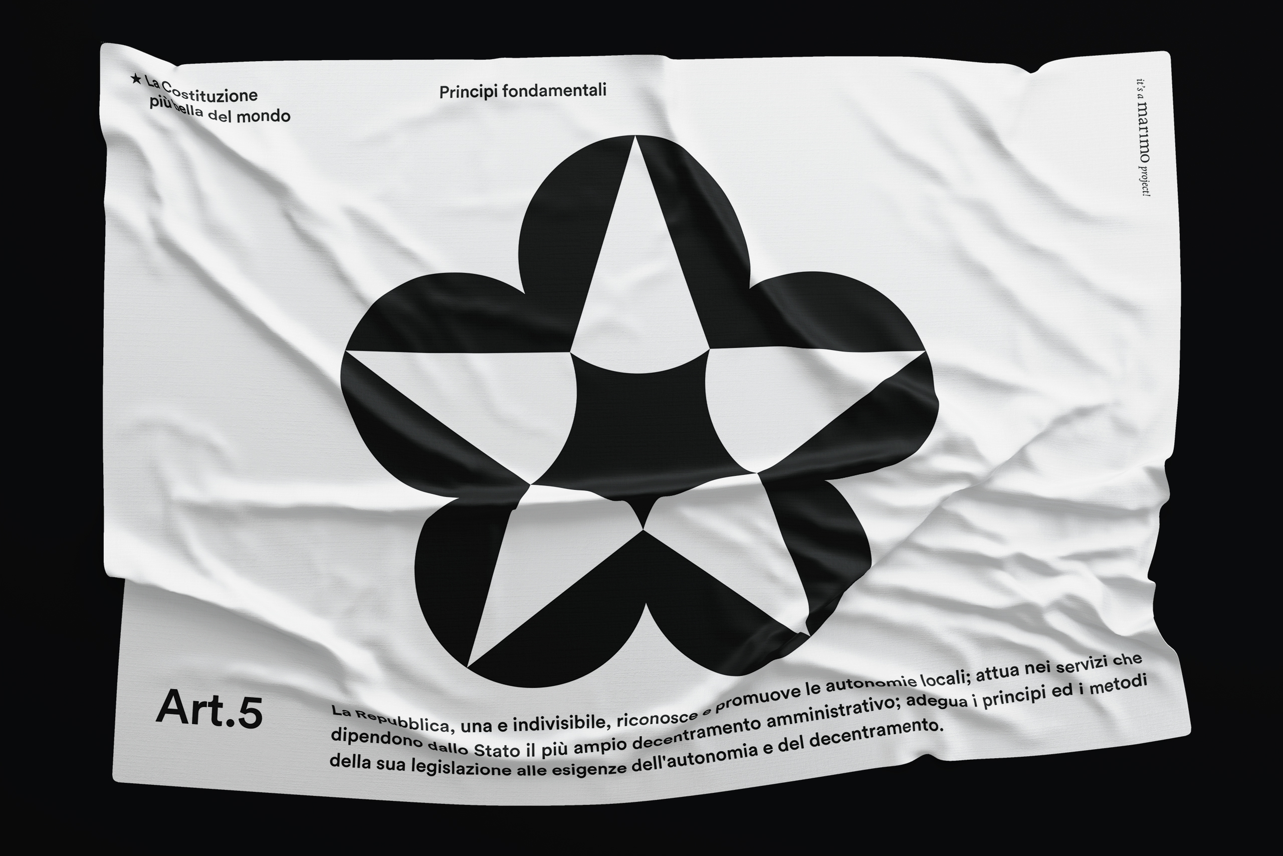
→ La Costituzione più bella del mondoSocial design, Identity

→ Fondazione Pastificio Cerere - Mvaḥ ChāExhibition identity
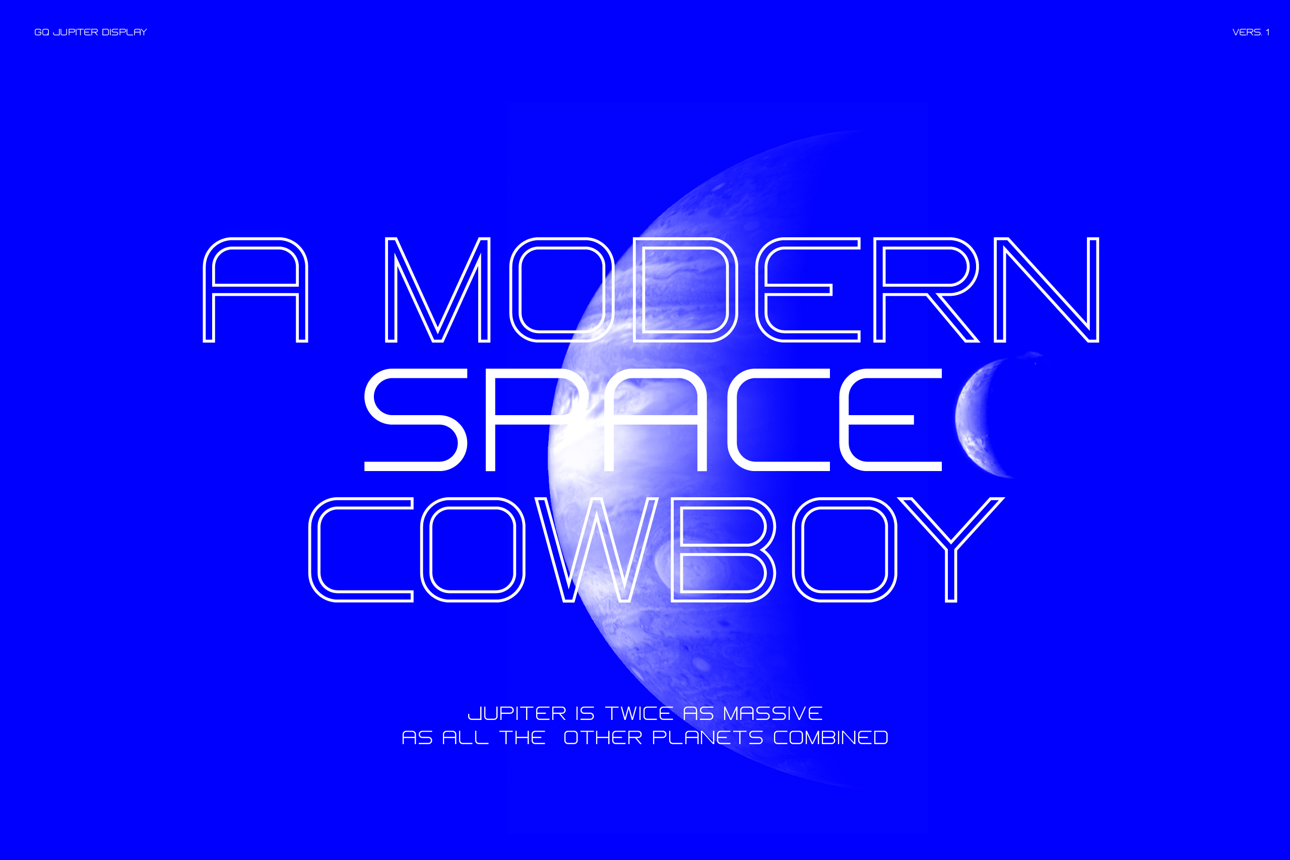
→ Jupiter DisplayTypography
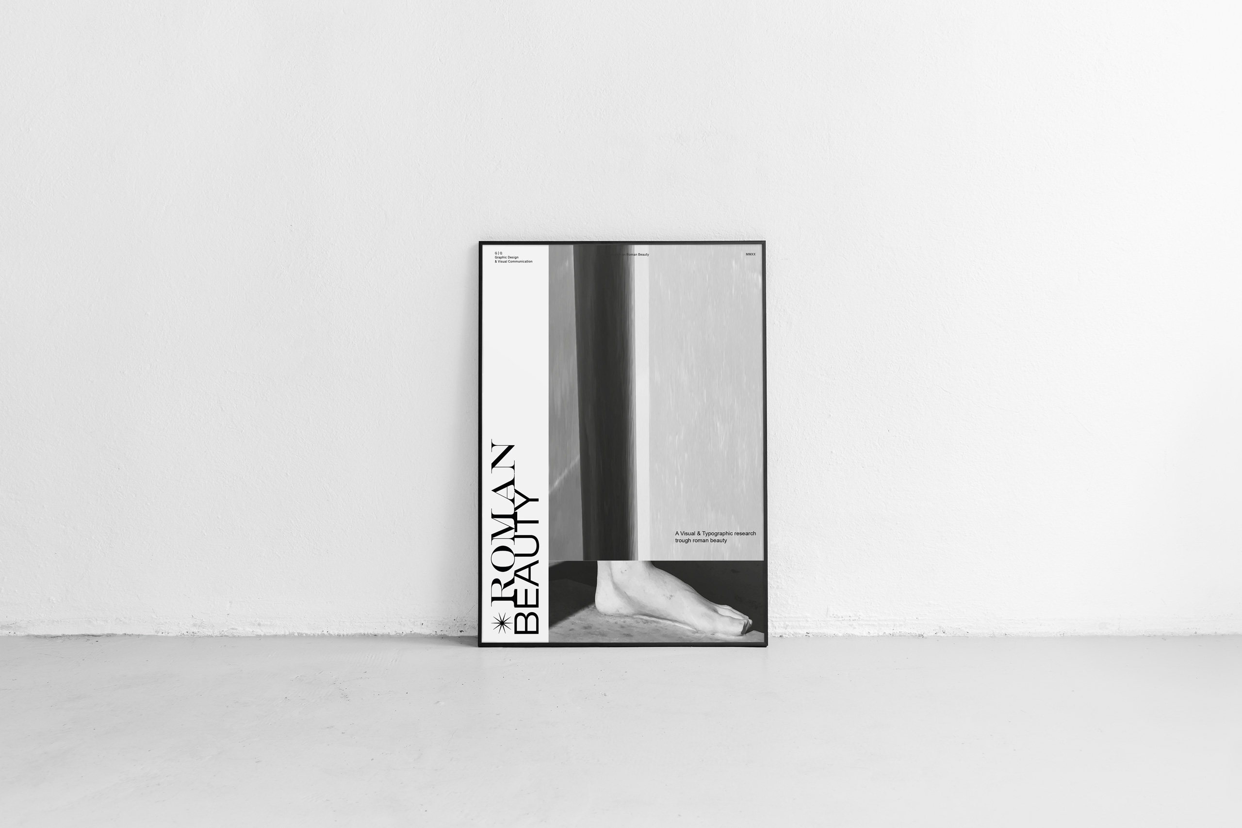
→ Roman BeautyEditorial / Print
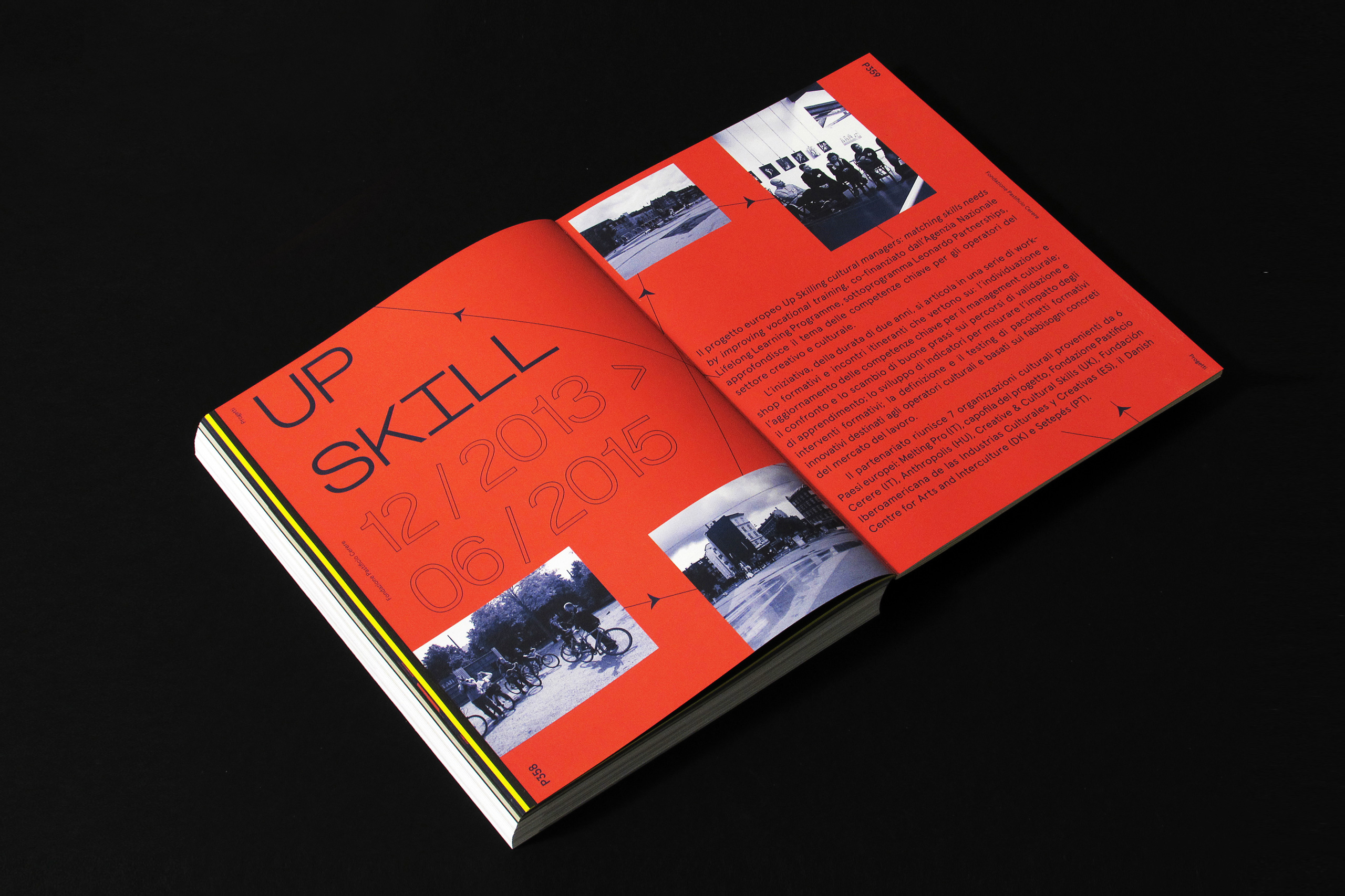
→ Fondazione Pastificio CerereEditorial
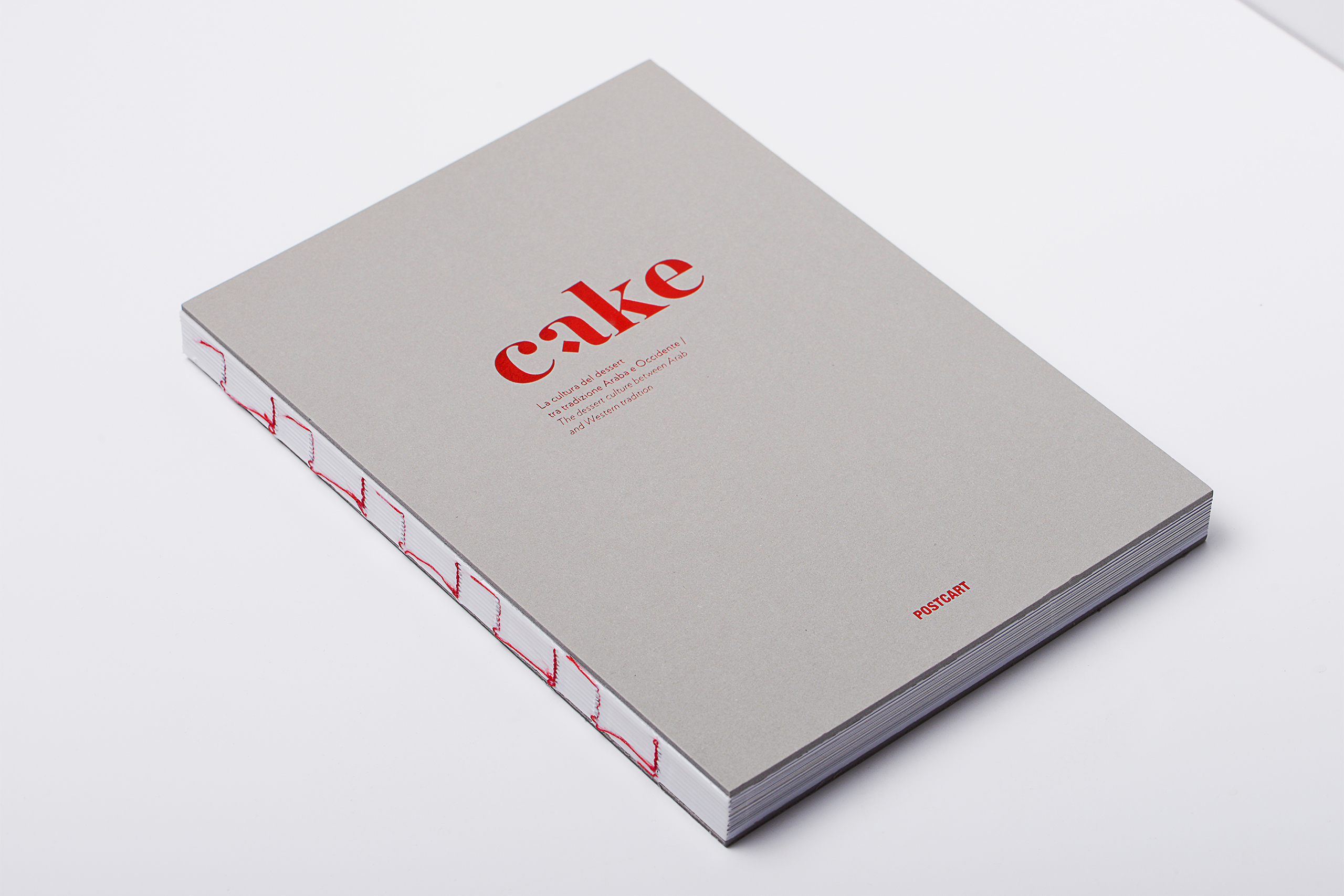
→ CakeEditorial
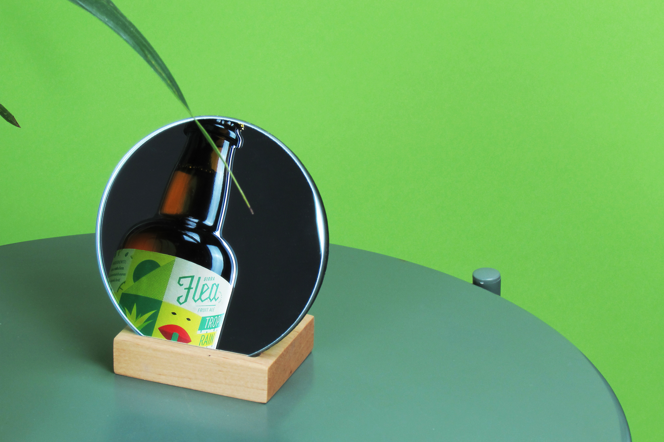
→ Birra Flea / Fruit AlePackaging
→ ObicEditorial
→ Symbola IdentityEditorial / Brand Identity
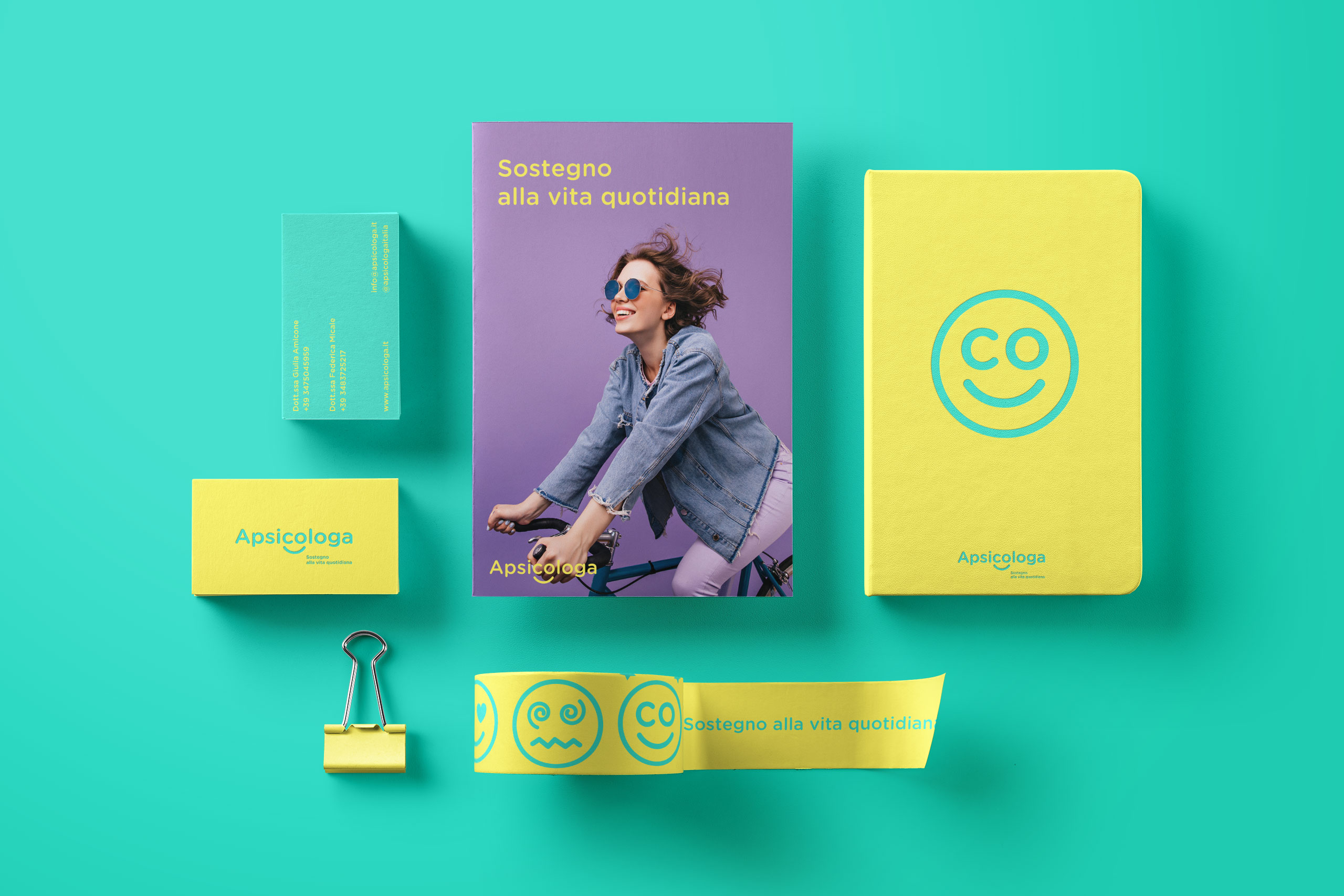
→ Apsicologa / Sostegno alla vita quotidianaBrand Identity
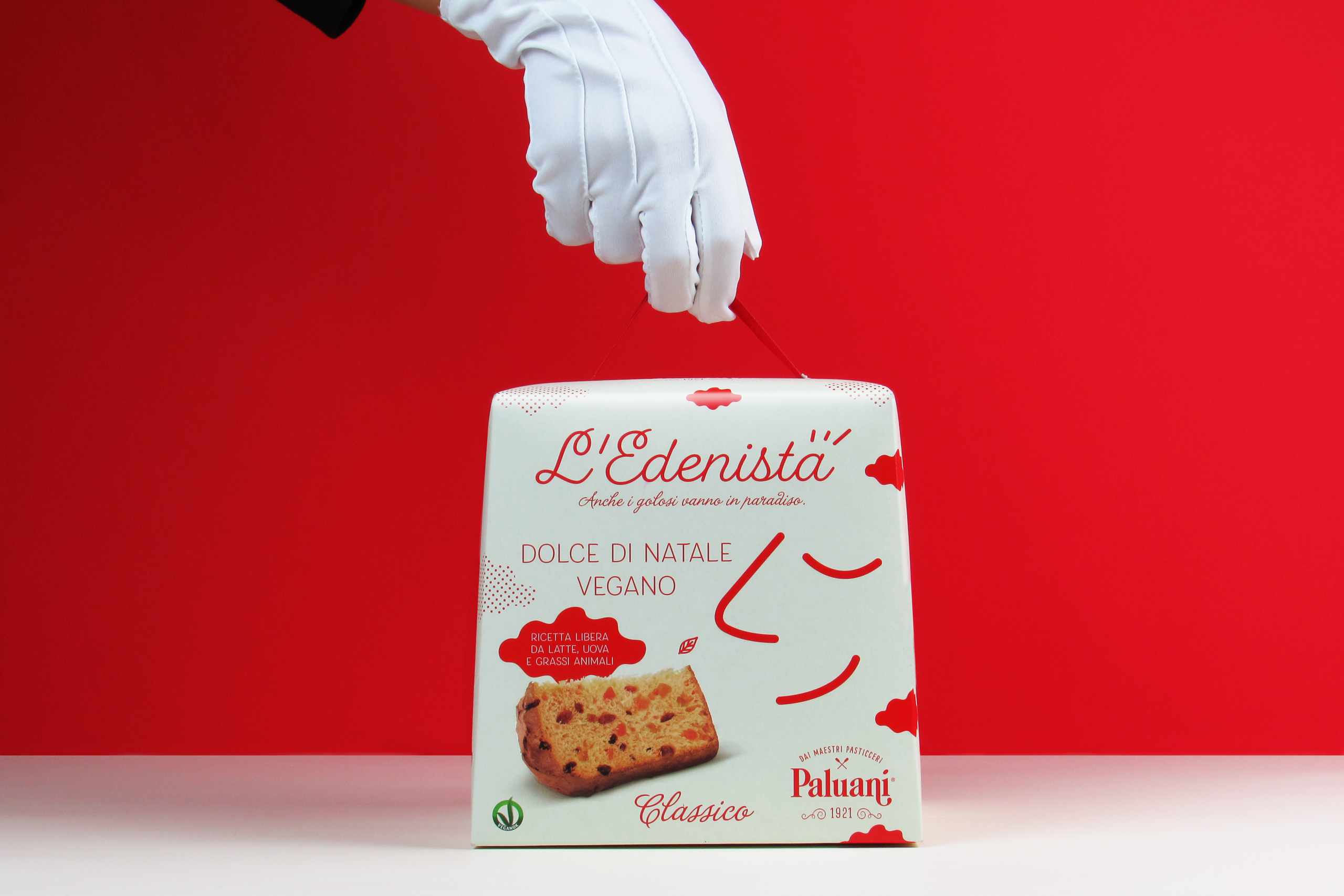
→ Paluani / L'EdenistaBrand Identity
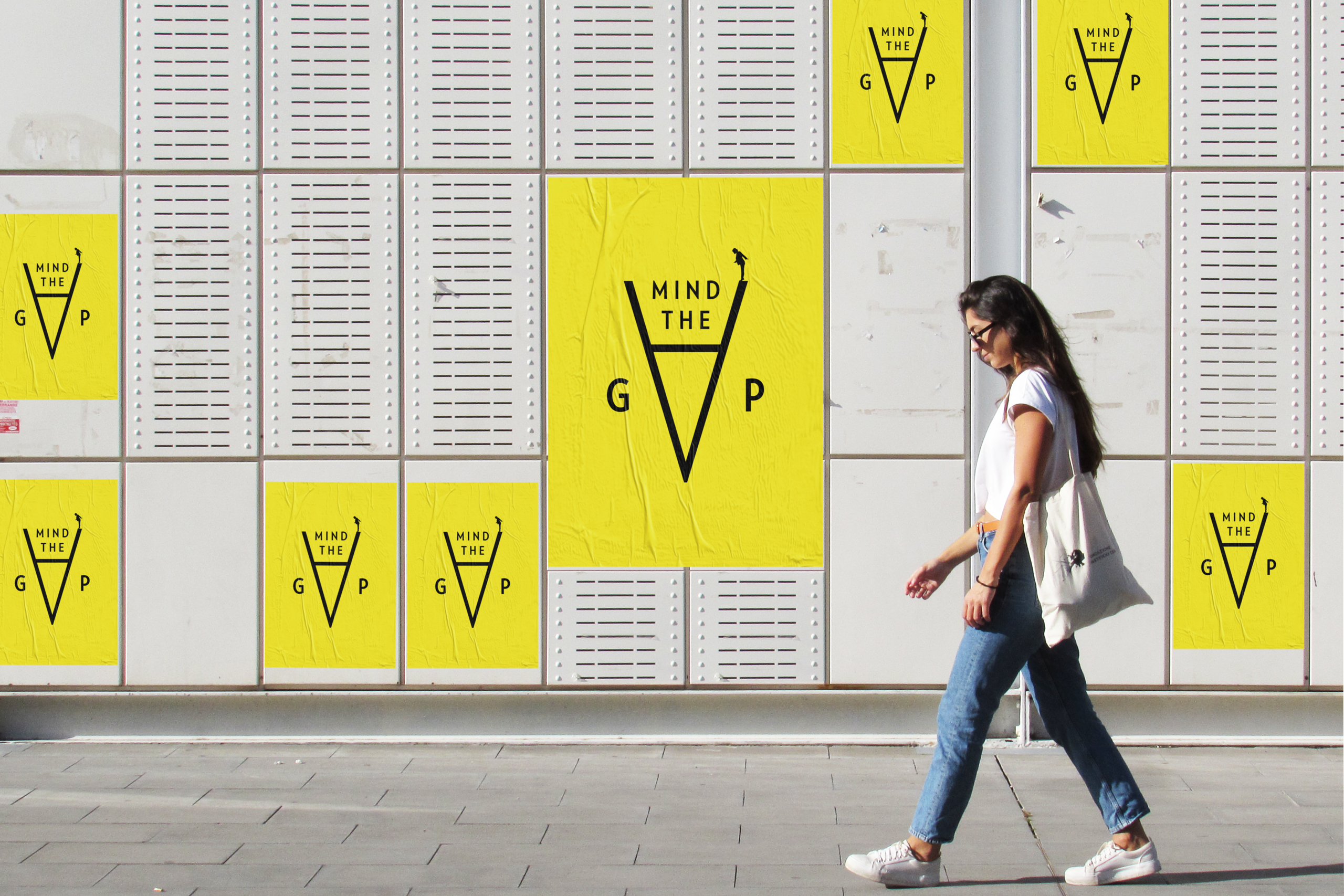
→ Il Messaggero / Mind the gapEditorial / Brand Identity
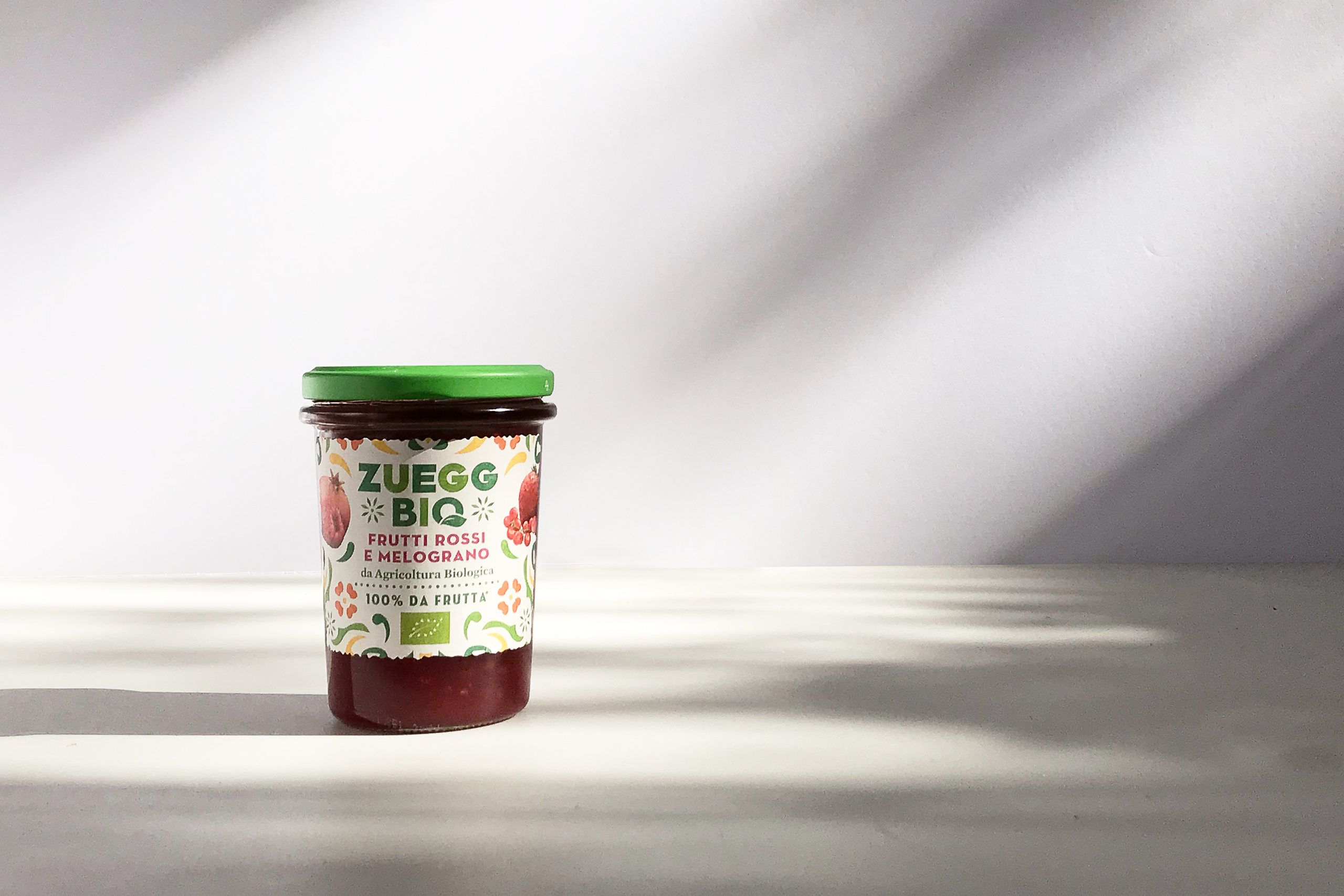
→ Zuegg Bio / IdentityOnline soon
→ Società Dante Alighieri / Maratona infernaleEditorial / Brand Identity

→ Bags Consulting / IdentityOnline soon
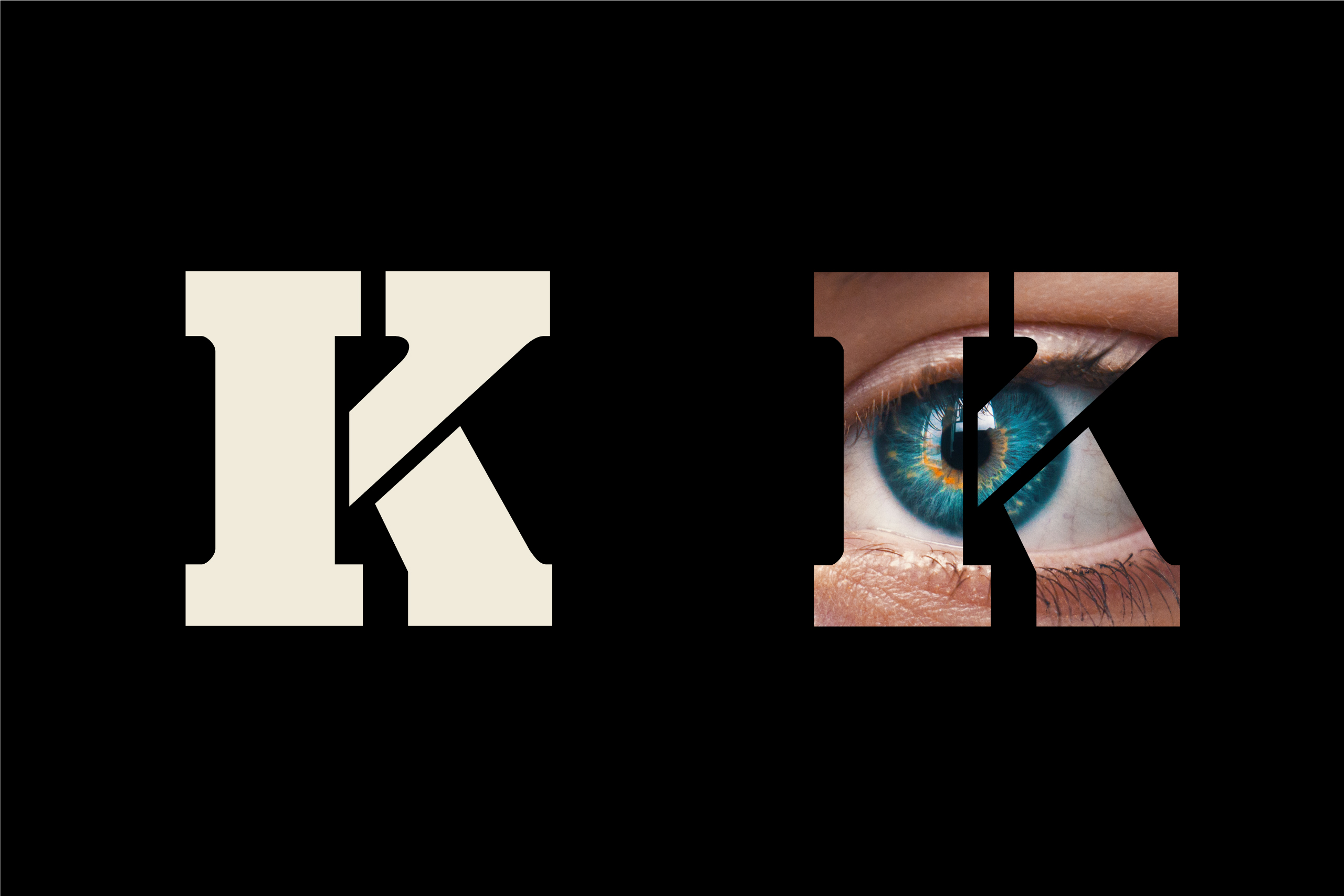
→ Rai tre / KilimangiaroEditorial / Brand Identity
→ Quarto dei MilleEnvironmental
© 2022 Giampiero Quaini
Graphic Design | Typography
& Visual Communication
Colophon - Privacy and Cookies
© 2019 Giampiero Quaini
Graphic Design &
Visual Communication
Colophon - Privacy and Cookies
© 2019 Giampiero Quaini
Graphic Design & Visual Communication
Colophon - Privacy and Cookies
© 2019 Giampiero Quaini
Graphic Design & Visual Communication
© 2019 Giampiero Quaini
Graphic Design & Visual Communication
+39 3934379906
info@giampieroquaini.com
+39 3934379906
info@giampieroquaini.com
+39 3934379906
info@giampieroquaini.com
+39 3934379906
info@giampieroquaini.com